Hi everyone,
We are very happy to announce that finally, after years of work, we are able to release the new Freesound user interface (UI) codenamed Beast Whoosh (or BW, or Freesound 3). It was early 2017 when we first contacted the UI/UX designer Marc Ruaix to work on a new version of Freesound and prepare it for the future. Our initial intention was to only make a small update of the visual look of the website, but we soon realised that bigger changes would be needed not only on the frontend but also on the backend if we wanted to continue adding new features to Freesound and making its development more sustainable. After the design was finished, we started working on its implementation but only intermittently. We’ve only had a few resources (i.e. hours) to spend on the efforts for the new UI, and the changes that have been finally implemented in both the frontend and backend have been enormous (much more than we anticipated). Fortunately, while implementing the new UI we took the opportunity to also modernise and refactor a lot of the code that runs behind Freesound. And now, after all these years, we’re finally ready to release the new Freesound 🙂
This new UI has been in public beta testing for almost 2 years, and many of you have contributed providing feedback and suggestions which have made it much much better. Even though the essential structure of Freesound remains unchanged with the new UI, you’ll see that it introduces a ton of improvements in terms of workflow and features. Also, it provides new ground for adding more new features in the future. What follows is a list of the most important changes and new features implemented by the new Beast Whoosh user interface:
- Updated overall look and feel to be plain and make navigation easier.
- Responsive design that adapts to mobile phones and tablets.
- The new UI includes a light theme and a dark theme that can be configured in your account settings.
- Different website sections are now available through the upper menus.
- Some detailed information like sound downloaders, sound comments, similar sounds (and more) is now shown using modals which allow you to access that information without having to leave to a different page.
- Added more sounds (and packs!) in the front page.
- The “Random sound of the day” section of the front page has been turned into a sort of game in which the sound name and description is not shown initially so you can guess what the sound is before displaying that information.
- The new “Manage sounds” page will allow sound uploaders to better keep track of the upload process of their sounds and manage sounds afterwards.
- You can now edit the description of multiple sounds at once, just like when you describe multiple uploaded files at once. You’ll find how to do it in the manage sounds page.
- In the sound description or in sound comments, you can now add timestamped annotations/comments that will render with little play buttons. See an example of this in this sound. You do that by typing some thing like #1:27 your comment to indicate that at minute 1 and 27 seconds, something happens.
- The interface for describing and editing sounds now also includes a sound player so you can listen to the sound while describing/editing its information.
- The new “Charts” page shows some statistics about user activity. This sort of replaces the old “People” page. If you have ideas of other statistics to add to this page, please let us now.
- An option has been added to the account settings to show sound spectrograms by default in sound players (instead of the waveforms). Also, spectrogram and waveforms can be toggled in any player by doing alt+click on them.
- An option has been added to the account settings do enable/disable sound playback polyphony. The default is to enable polyphony, that is to say, two enable multiple sounds playing at the same time (which is how Freesound has worked over the years). Also, even if you have the polyphony activated, you can now do alt+click on the play button on sound players to stop any other sound that was playing and start playing the selected sound.
- An option has been added to the “advanced search” panel to show search results in a grid which allows to get more search results in less screen space (also, in grid mode 30 sounds are returned per page instead of 15). This addresses some concerns raised by users testing the new UI about the number of sounds visible on screen. The preference for grid display is remembered per user account.
- An option has been added to the “advanced search” panel to return only remix sounds in search queries. This will only return sounds that either have been remixed or are a remix of other sounds from Freesound.
- An option has been added to the licenses filter in the search page to filter results by Free Cultural Works approved licenses (that is to say, sounds under CC-BY or CC0).
- Sound bookmarks are no longer named, but they can still be categorized. Also, bookmarks are no longer public to other users. We’re planning many improvements in relation to bookmarks (including a rename to Collections), so stay tunned.
- You can now bookmark a sound by doing alt+click on the bookmark button, and this will save the bookmark under the last bookmark category that was used without displaying the bookmarking interface. This is a great way of quickly adding bookmarks.
- The “Map” page now has an option to filter by tag (and also embed the maps generated using that filter).
- The “Search” page now has an option under the advanced search options to Display results as packs. This options effecitvely allows to search for packs in the search page.
- The pages to display the full list of sounds or packs by a user now use the search page (with a username filter applied). This allows to further sort, match and filter the list of sounds.
- The “Tags” page now uses the same backend as the search page, which allows to filter by tags but also to apply other filters from the search page.
- The similar sounds option now returns 5 pages of similar sounds instead of only 1.
Note that during some days you’ll still have the chance to switch back to the old UI by using the three dots menu at the top menu of Freesound. However, this option will be disabled in the coming days.
That’s all for now,
We hope you enjoy the new Freesound!
frederic, on behalf of the Freesound team
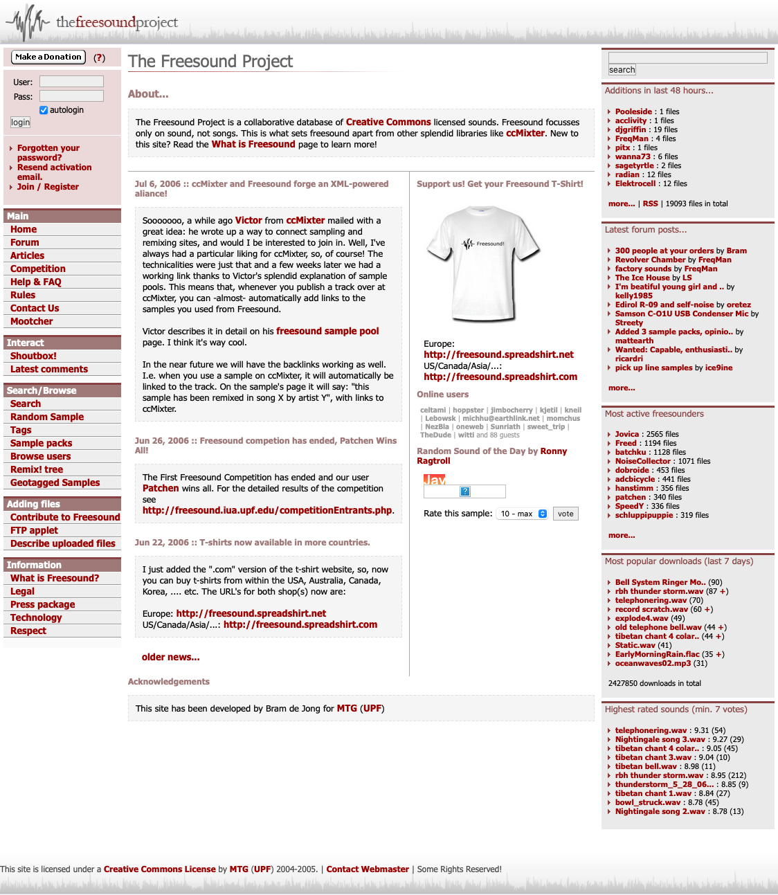
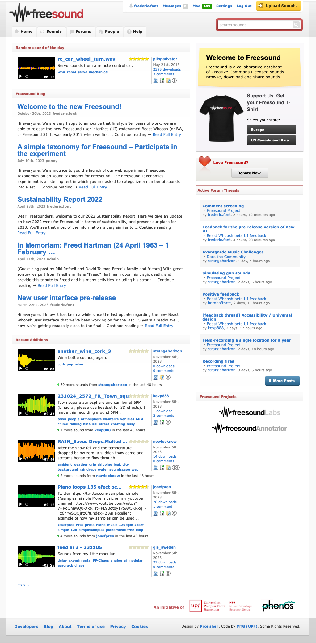
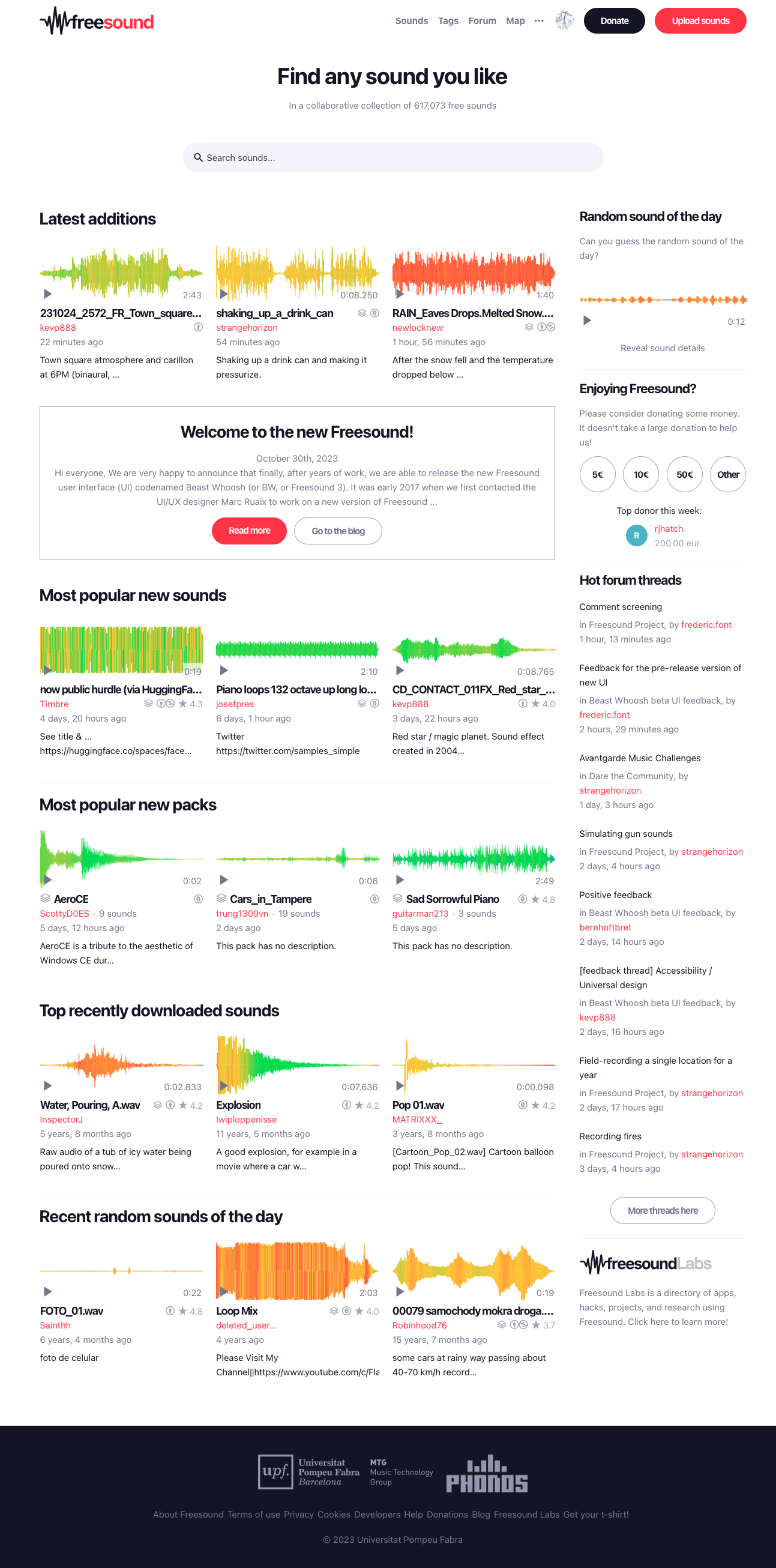
EDIT: just for the record, I’m adding below screenshots of the Freesound landing page for the original website (back in mid 2000s), the Freesound 2 update (which happened in 2011) and the current Freesound 3 update (2023).
It looks way better!
OMG … I love it! It looks to good 😀 thank you so much!
I wish you could have kept the old user interface or give us a choice to use the old user interface. It irritates me. I had gotten used to the old interface’s looks.
I really enjoyed the old interface, I wish it could be an option to return back to! 🙁 All of the other new changes and additions are awesome, and being more accessible on mobile devices and a dark theme is really helpful, but I can’t help but mourn the old web look. It’s harder to distinguish freesound’s new look from the myriad of sites with minimalist web design.
The new website UI is simply amazing. Congratulations on your upgrade! And thank you for persisting.
The new design seems nice and I’m sure the team worked very hard on it. However, I would very much appreciate leaving in the option to switch to the old UI for those of us that would prefer it. I’m most familiar with the old UI and my workflow is very important to me.
Yeah a “legacy” option to have the old UI would be real nice. I understand that you want to facelift the site, but I don’t enjoy it. 🙂
Please add an option to switch between old ui and new ui
Thanks everyone for the comments! Unfortunately we’re not going to be able to keep the old UI as we can’t maintain two UIs at the same time. One of the reasons for switching to a new UI was that the code for the old UI was not very manitainable and would not easily let us continue improving Freesound in an optimal way. The UI is much more maintainatble and prepared for the future.
The new UI is awful. It is optimized for tablet use… which is not how your site is normally used. Buttons too large. Too much scrolling required. You have slowed down workflow tremendously. This is really, really bad…
i personally like the older ui as i tend to prefer older web designs, however i do understand the need to switch to an overhauled version as mentioned earlier, hopefully at somepoint someone will make a custom theme for the new ui that emulates the older ui while keeping some of the new features
Please never remove the old ui.
Good work! Loving the new UI and displays. Thank you for your dedication 🙂
What happened to the option that let you use the old UI?
love it
Thanks everyone for all the comments! The old UI is now gone and there is no longer the option to use it. But we’ve been discussing with the community and adding/fixing many things in the new UI, feel free to join the conversation.
Awesome! Really like what you’ve done with the new design. Feel bad for you when seeing all the negative feedback in the forums.
I will no longer use Freesound if the new UI is kept; it’s truly awful that you felt the need to give into horrible modern “design” pressure like this. What a waste of what was a great website and resource just a week ago. You’ve completely ruined the workflow of so many professionals it isn’t even funny.
Might I add that you absolutely have the ability to bring the old UI back, as you showed it working in your screenshot of “Freesound 2” with this blog post already up. Meaning the old UI is actually still running, but hidden from the user. Past initial work to add a setting to switch between them, you wouldn’t need to maintain the old UI in any meaningful way; users could accept a disclaimer that the old UI is unsupported and may not support new features/may break in certain ways in the future. This is much better practice than violently ripping the carpet out from your users overnight. Elon Musk is already busy doing that to Twitter, and you’ve just done the exact same thing.
Thanks everyone for the comments! Yes, we got some negative feedback, in some cases quite disrespectful and pointless, but also in some cases very constructive and also packed with suggestions for improvement which we took into consideration and helped us improve Freesound. Discussions have been happening in the forums about the new UI for a long time (see https://freesound.org/forum/beast_whoosh_beta_ui_feedback/) so I’m not going to answer all individual comments here as most of them are repeated. Nevertheless I would like to provide an answer to protowave’s last comment about keeping the old UI (even though it has also been discussed in the forums): the code for the old UI is no longer in our codebase. It was surely there when I took the screenshot a couple of days after the release of the new UI, but not anymore. We have not “violently ripped the carpet out from our users overnight”. The new UI has been coexisting with the old one for almost 2 years. The first public beta was announced 1 year and 10 months ago, and at that time people could start using it and switching between the two UIs. Also during the last months there was a button in the front page with a link to the new UI situated in a very visible place. Many people participated in the public beta and provided feedback that we used to improve Freesound. We’re actually still doing it, discussing in the forums and deploying new improvements every day. This is definitely not Elon Musk’s way.
Freesound is a university project and it is maintained by an incredibly small team of people. We have to combine Freesound development with so many other tasks, including research around Freesound (which is awesome). We can’t keep two UIs running. In fact, one of the reasons for making a new UI was to optimise the way it is implemented so we could simplify some code and make the whole site easier to maintain for us. But we have not sacrificed any relevant functionality, on the contrary, we added more stuff (see here https://freesound.org/help/faq/#what-are-the-new-features-brought-by-the-new-user-interface).
let us change it back 🙁
Love the look. Dont listen to the naysayers, any change is a jarring experience and some people will need more time to adjust, but they’ll come to appreciate it in time. Thanks for the dark mode.
Well done. As more of a downloader than an uploader of sounds (I use them for podcast sound effects), I love the new UI. And after 10+ years, it was time for a new look to carry Freesound into the future! 🙏
I love new UI. Thank for the work!
Fantastic work! The new site looks AMAZING!!
Sound bookmarks are no longer named, but they can still be categorized. Also, bookmarks are no longer public to other users. We’re planning many improvements in relation to bookmarks (including a rename to Collections), so stay tunned.
It looks great, fantastic job team!
Nice web design! But I can’t figure out how to download?!
I think it looks absolutely phenomenal! Big congrats to all
of those concerned, fantastic job!
Oh wow! Great job with the new UI and the new features. Congratulations!
I like how it looks, and the new features, but just one minor gripe. Copying tags creates one long string, then I have to copy them to a text editor to separate them. I was going to mention text alignment on the profile page, but that seems good now.
There is a “copy tags” button now in the description form that will help with that. Selecting and copying is still possible but it will not work the same in all browsers.
🥳 Congratulations!!! 🎉
Could you please make an option with new UI and old?
I really enjoyed Freesound.org in the past but the new website is so slow it is unbelievable. It takes up to a minute for any sounds to actually play which makes it unreasonable to use to find sounds that are a good match. This website was such a wonderful resource for making projects that I hope you will consider reverting.